Formerly known as the Shin Kong Place, the now Beijing SKP immediately achieved profits when it opened. From 2008 to 2011, it maintained an amazing 30% turnover for four consecutive years. In 2011, it was top ranked among mainland China department stores with RMB 6.5 billion in sales. According to the 2018 and 2019 Sybarite reports, in terms of sales per squre foot, SKP was globally ranked respectively fourth and second. How can this super department store located in the Northeast corner of Dawang bridge achieve such success? And what kind of role lighting plays in this story?
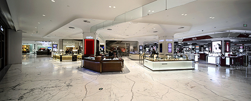
In November 2014, Beijing Shin Kong Place was officially renamed as Beijing SKP and opened grandly after the fourth floor’s renovation. Sybarite’s design looked beyond the conventional space of a department store first through the new brand identity of SKP and brought shapes that echo this identity throughout the interior. The original and conventional angular shapes were diluted into fresh new waves of curves full of vitality that referred to SKP’s new logo. Similarly, the original lighting that was available for the 2008 opening in the forms of halogen, metal halide and fluorescent lamps were gradually replaced by more efficient LED lighting fixtures. LDPi started being involved from the focusing the light of the fourth floor and the food court in the basement respectively on the luxurious women shoes and the dining tables.
For key design elements, SKP’s had actual scale mockups built for review and confirmation for the look and feel, materials, lights and construction quality.
With Sybarite’s design in its hands, SKP could properly plan its staggered renovation of other floors while keeping its doors open for business as usual.
After the third floor renovation was completed, Michael Ferrera, SKP’s former senior director of store planning and design, made an unexpected remark about the lighting: “You have created a problem!”. Indeed, Mr Ferrera indicated that the tier-one luxury brands of the fourth floor, where the lighting designed by another company was dimmer, were envious of the lighting effect for the Ready-to-wear local brands on the third floor and designed by LDPi. Who doesn’t like to have this kind of problem?
LDPi’s work continued with the entire public areas of B1 (including SKP SELECT and Fashion Street), 1F, 2F, 3F (including the SPA, women’s lingerie and Saks Fifth Avenue); 4F Rendez-Vous ; 5F (only for Home Select, Cousteau restaurant, Card Center, Nursing Rooms and Children’s Toy area) and 6F (including the Beijing Kitchen).
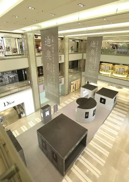
1F Atrium (before renovation)
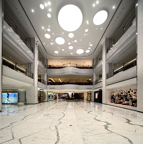
1F Atrium ( after renovation)
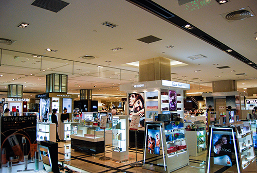
1F Beauty Area (before renovation)
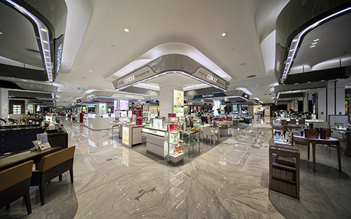
1F Beauty Area (after renovation)
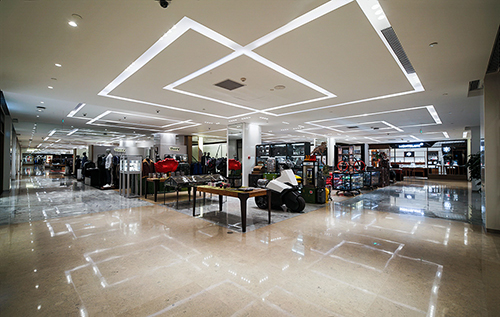
2F
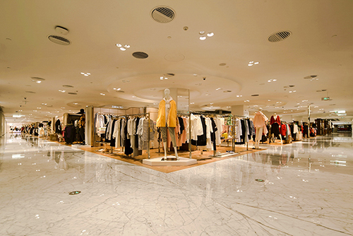
3F Ready-to-wear Area
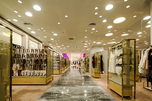
3F Women’s Lingerie
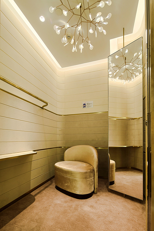
3F Dressing room for Women’s Lingerie
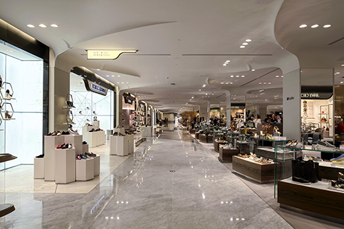
4F Shoe area